

前言
Flutter中几乎所有的对象都是一个Widget(组件),包括两大类,分别是StatelessWidget(无状态Widget)和StatefulWidget(有状态Widget)。在编写应用程序时,通常会创建新的widget,这些widget是无状态的StatelessWidget或者是有状态的StatefulWidget, 具体的选择取决于您的widget是否需要管理一些状态(控件的文字、颜色、数据等进行刷新更改)。
StatelessWidget
常用组件库
graph LR
O(StatelessWidget)------> A(Container 容器)
O(StatelessWidget)------> B(Text 文本)
O(StatelessWidget)------> C(Icon 图标)
O(StatelessWidget)------> D(CloseButton 关闭按钮)
O(StatelessWidget)------> E(BackButton 返回按钮)
O(StatelessWidget)------> F(Chip 标签)
O(StatelessWidget)------> G(Divider 分隔线)
O(StatelessWidget)------> H(Card 卡片快)
O(StatelessWidget)------> I(AlertDialog 弹框)
实践示例
Container
-
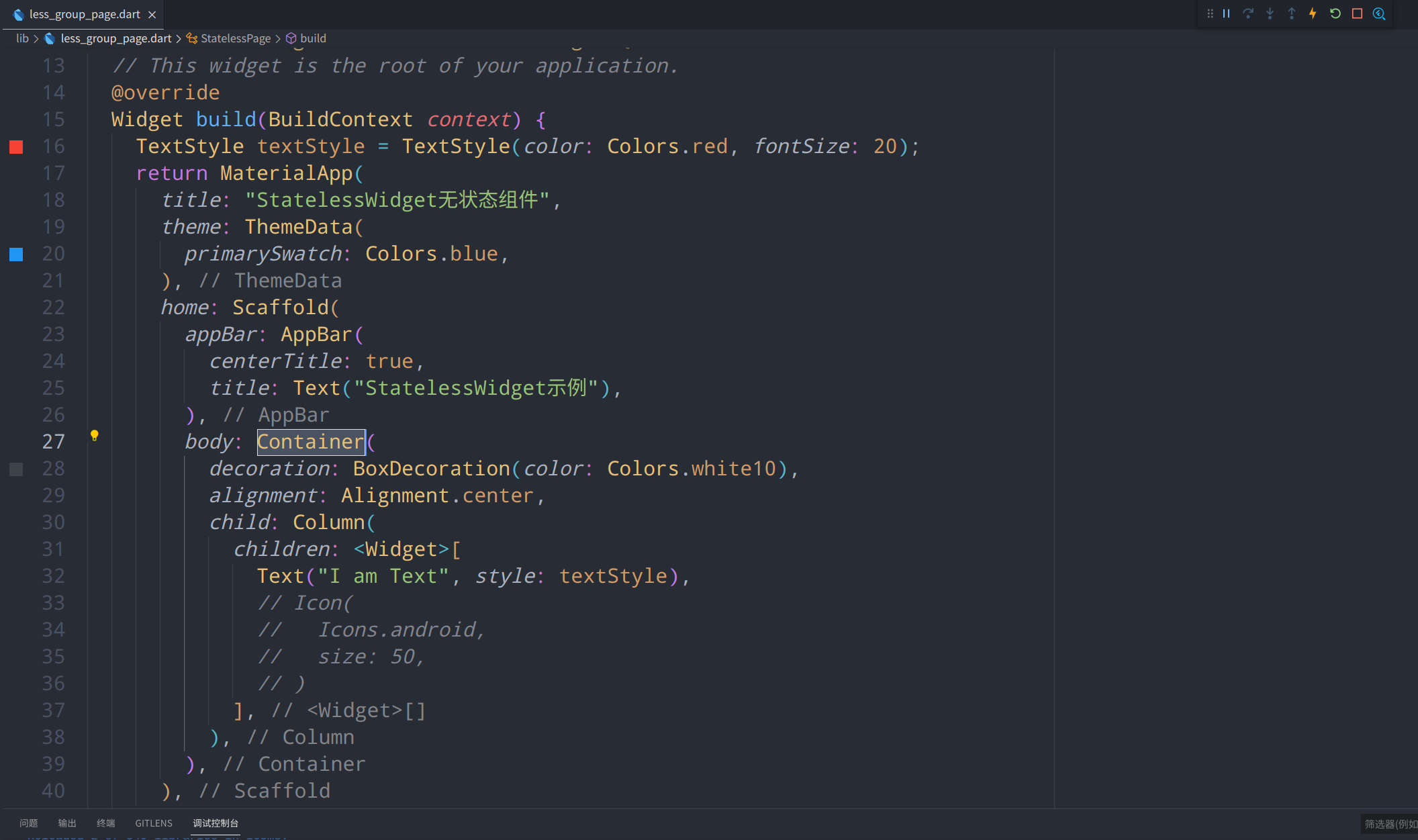
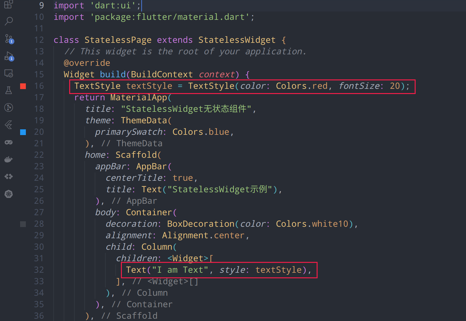
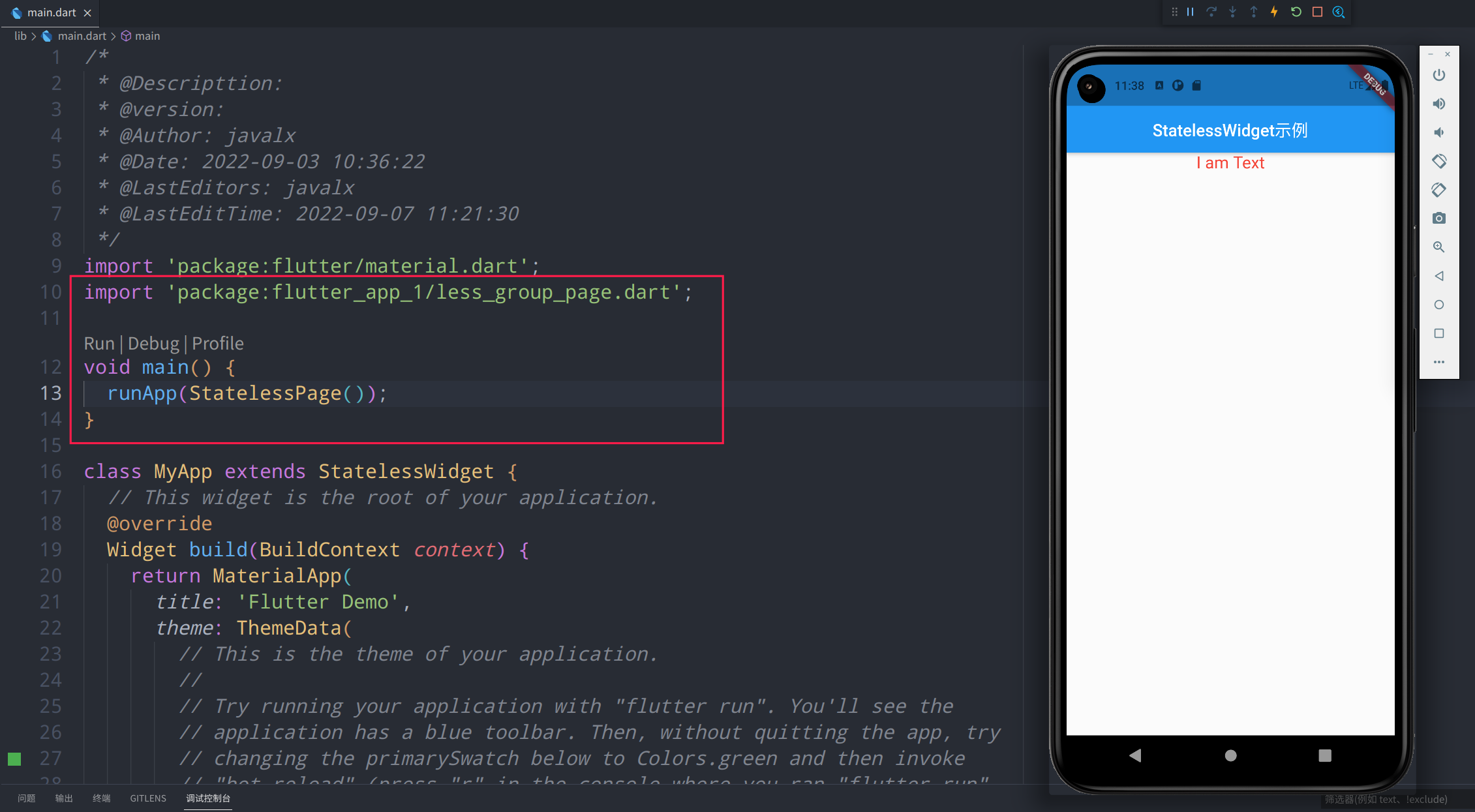
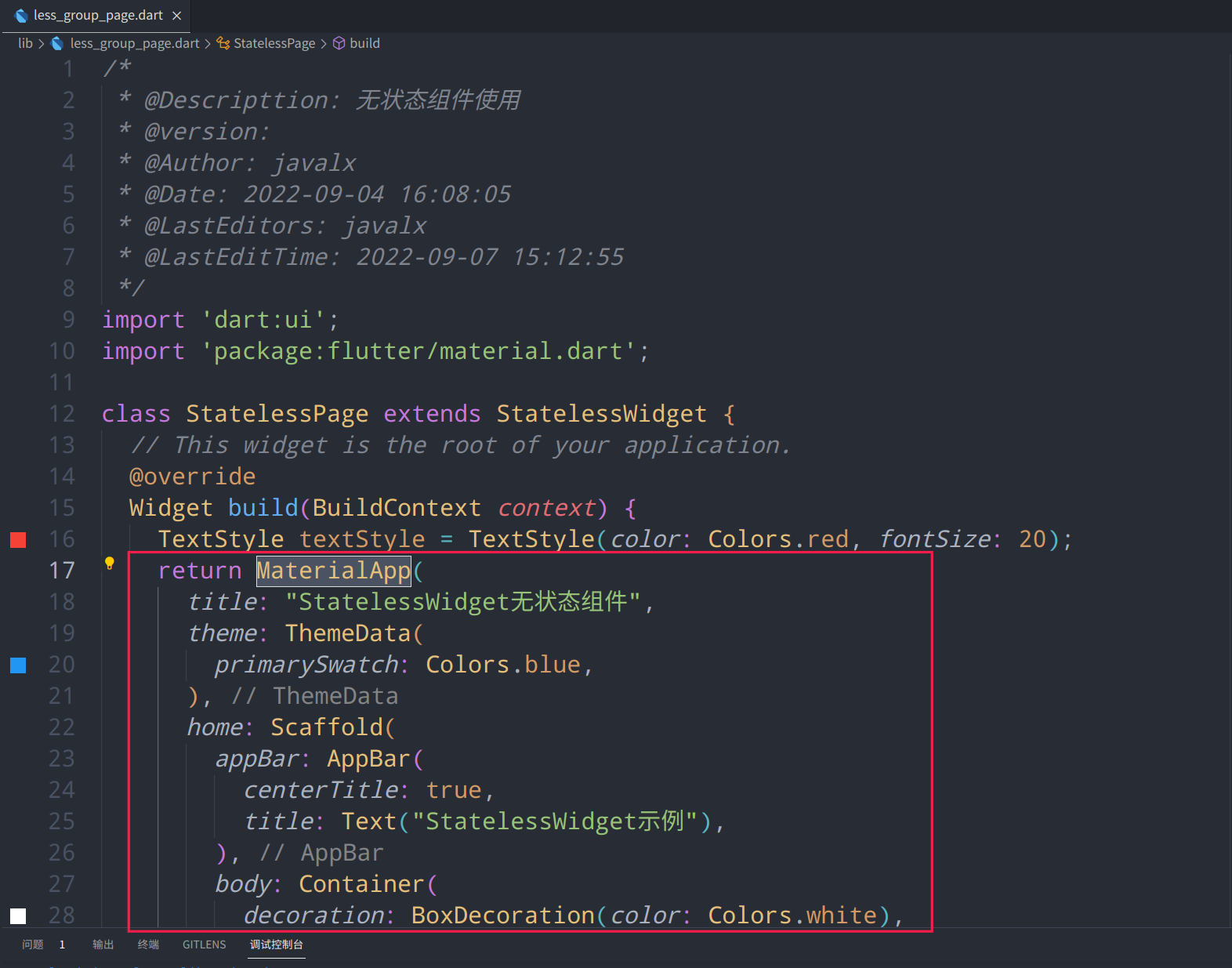
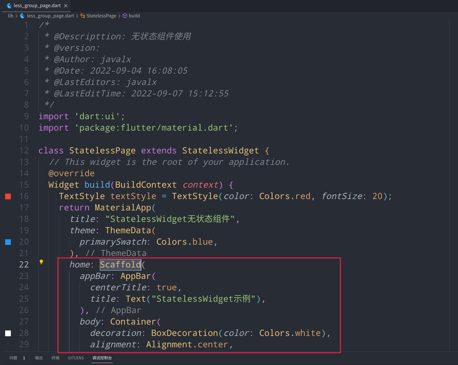
代码
/* * @Descripttion: 无状态组件使用 * @version: * @Author: javalx * @Date: 2022-09-04 16:08:05 * @LastEditors: javalx * @LastEditTime: 2022-09-07 11:18:00 */ import 'dart:ui'; import 'package:flutter/material.dart'; class StatelessPage extends StatelessWidget { // This widget is the root of your application. @override Widget build(BuildContext context) { // 样式定义 TextStyle textStyle = TextStyle(color: Colors.red, fontSize: 20); return MaterialApp( title: "StatelessWidget无状态组件", theme: ThemeData( primarySwatch: Colors.blue, ), home: Scaffold( appBar: AppBar( centerTitle: true, title: Text("StatelessWidget示例"), ), body: Container( decoration: BoxDecoration(color: Colors.white10), alignment: Alignment.center, child: Column( children: <Widget>[ // 主要代码 Text("I am Text", style: textStyle), ], ), ), ), ); } } -
图例
-
说明
Container是Flutter里很常用的一个组件,类似于html中的div
参数名称 参数类型 参数说明 参数示例 alignment AlignmentGeometry 设置子元素的对齐方式 Alignment(1.0, 0.0) padding EdgeInsetsGeometry 内边距,设置子元素的填充方式 EdgeInsets.fromLTRB(10, 5, 0, 1) color Color 设置简单的背景颜色 Colors.red、Colors.green decoration Decoration 背景装饰器:设置背景色、背景图、边框、圆角、阴影、渐变色等 BoxDecoration(color: Colors.white) foregroundDecoration Decoration 前景装饰器:同上 BoxDecoration(color: Colors.white) width double 设置Container的宽度 400 height double 设置Container的高度 600 constraints BoxConstraints Container的大小可以通过 width、height来指定,也可以通过constraints来指定;当它们同时存在时,width、height优先;实际上Container内部会根据width、height来生成一个constraintsBoxConstraints.expand() margin EdgeInsetsGeometry 外边距 EdgeInsets.all(5) transform Matrix4 变换:控制子组件的平移、旋转、缩放、倾斜 Matrix4.rotationZ(0.5) transformAlignment AlignmentGeometry 设置变换的锚点 Alignment(0, 0) child Widget 子元素 Text("I am Text") clipBehavior Clip 剪切 Clip.none
Text
-
代码
// 样式定义 TextStyle textStyle = TextStyle(color: Colors.red, fontSize: 20); // 主要代码 Text("I am Text", style: textStyle), -
图例
-
说明
参数名称 参数类型 参数说明 参数示例 data String 文本内容 "I am Text" style TextStyle 文本样式 TextStyle(color: Colors.red) strutStyle StrutStyle 文本布局样式,字体偏移等,使用时 style 属性必须有值 StrutStyle(leading: 2) textAlign TextAlign 文本对齐方式 TextAlign.left textDirection TextDirection 文本方向,和 textAlign 效果一致 TextDirection.ltr locale Locale 区域设置,基本不会用 softWrap bool 是否自动换行 true overflow TextOverflow 超出截取方式,clip->直接截取,fade->渐隐,ellipsis->省略号 TextOverflow.ellipsis textScaleFactor double 字体缩放 1.25 maxLines int 最多显示行数 3 semanticsLabel String 语义标签,如文本为"$$",这里设置为"双美元" textWidthBasis TextWidthBasis 测量行宽度 TextWidthBasis.longestLine textHeightBehavior ui.TextHeightBehavior 官方备注: 定义如何应用第一行的ascent和最后一行的descent
Icon
-
代码
Icon( Icons.android, size: 50, ) -
图例

-
说明
参数名称 参数类型 参数说明 参数示例 icon IconData 图标 Icons.android size double 大小 50 color Color 颜色 Colors.amber semanticLabel String 语义标签 "村上春树" textDirection TextDirection 文本方向 TextDirection.ltr
CloseButton
-
代码
CloseButton( color: Colors.greenAccent, ) -
图例
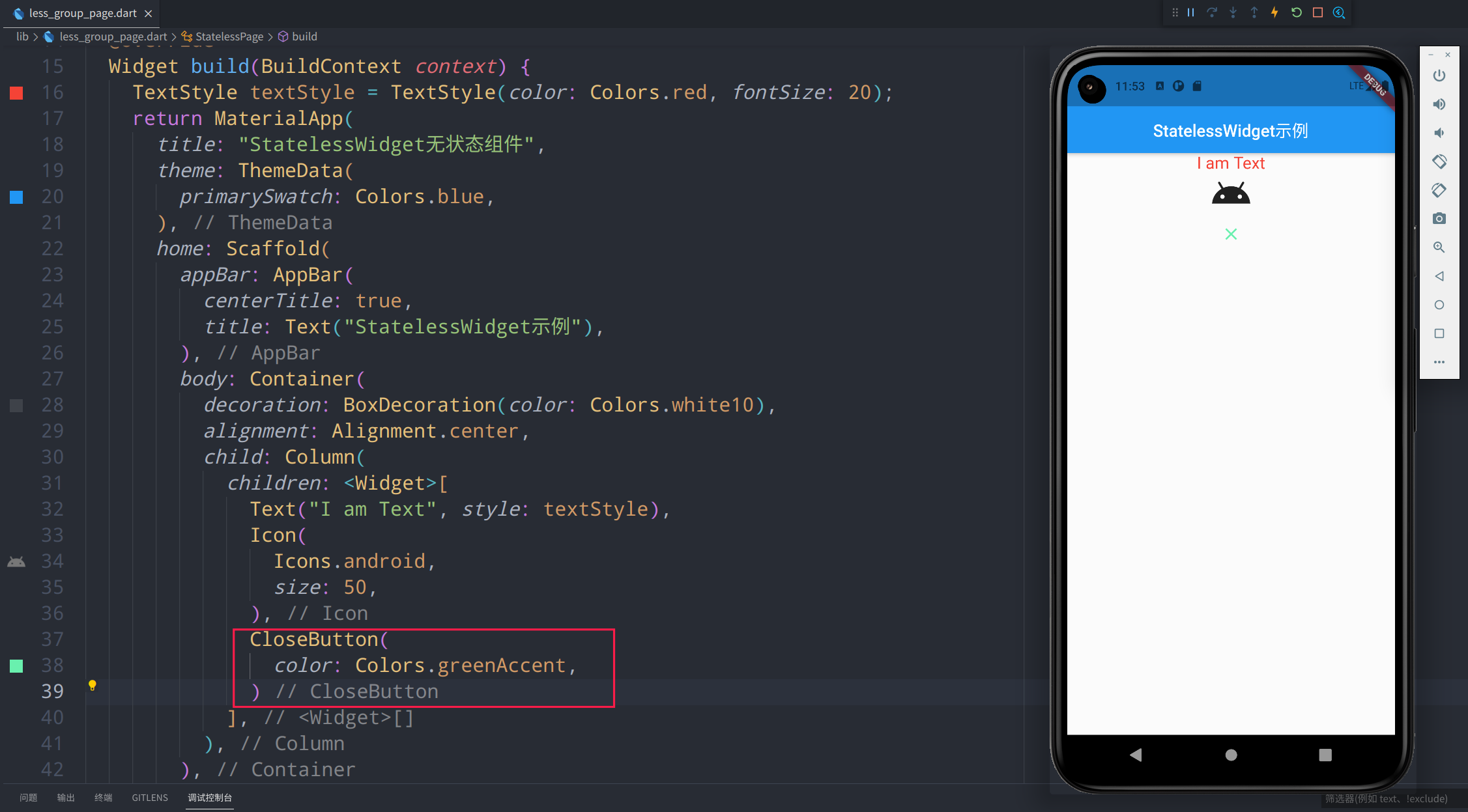
-
说明
参数名称 参数类型 参数说明 参数示例 color Colors 按钮颜色 Colors.greenAccent onPressed Function 点击事件 (){...}
BackButton
-
代码
BackButton( color: Colors.amberAccent, ) -
图例
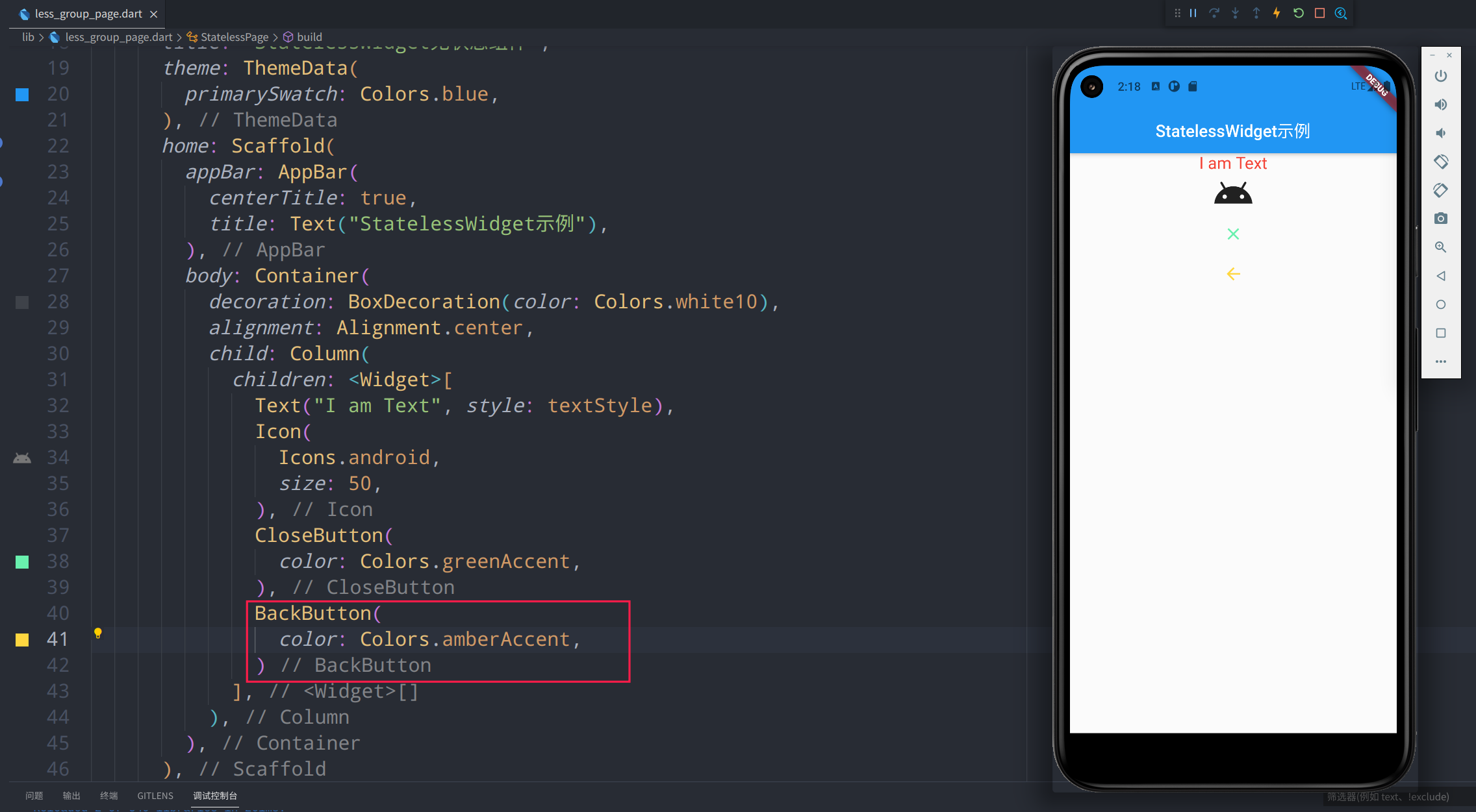
-
说明
参数名称 参数类型 参数说明 参数示例 color Colors 按钮颜色 Colors.greenAccent onPressed Function 点击事件 (){...}
Chip
-
代码
Chip( avatar: Icon( Icons.people, color: Colors.deepOrangeAccent, ), label: Text( "尼古拉斯-赵四", style: TextStyle(color: Colors.pink), )) -
图例

-
说明
参数名称 参数类型 参数说明 参数示例 avatar Icon 左侧图标组件 Icon(Icons.people) label Widget @required 文本 Text("尼古拉斯-赵四") labelStyle TextStyle 文本样式 TextStyle(color: Colors.green) labelPadding EdgeInsetsGeometry 文本外边距 EdgeInsets.fromLTRB(10, 20, 0, 5) deleteIcon Widget 右侧删除按钮 Icon(Icons.close) onDeleted Function 删除按钮点击事件 () {...} deleteIconColor Color 删除按钮颜色 Colors.green useDeleteButtonTooltip bool 开启删除按钮提示 true deleteButtonTooltipMessage String 删除按钮的长安提示 "长按提示!" side BorderSide 设置外边线 new BorderSide(style: BorderStyle.solid, color: Colors.green)) shape OutlinedBorder 设置包裹形状 RoundedRectangleBorder(borderRadius: BorderRadius.circular(2.0)) clipBehavior Clip 裁剪方式 Clip.none focusNode FocusNode 焦点控制 autofocus bool 自动聚焦,默认为 false true backgroundColor Color 背景色 Colors.white70 padding EdgeInsetsGeometry 内边距 EdgeInsets.fromLTRB(0, 10, 0, 0) visualDensity VisualDensity 紧凑程度 VisualDensity.compact materialTapTargetSize MaterialTapTargetSize 内边距,设置感应区域 MaterialTapTargetSize.padded、MaterialTapTargetSize.shrinkWrap elevation double 阴影高度,默认为 0 10 shadowColor Color 阴影颜色 Colors.blue
Divider
-
代码
Divider( color: Colors.green, height: 10.0, indent: 5, endIndent: 5, thickness: 2, ) -
图例

-
说明
参数名称 参数类型 参数说明 参数示例 color Colors 按钮颜色 Colors.greenAccent height double 组件整体高度 10 indent double 分割线前距离(左间距) 5 endIndent double 分割线后距离(右间距) 5 thickness double 线的高度 2
Card
-
代码
Card( color: Colors.grey, shadowColor: Colors.redAccent, elevation: 4, shape: RoundedRectangleBorder( borderRadius: BorderRadius.circular(10), side: BorderSide( color: Colors.greenAccent, width: 3, ), ), margin: EdgeInsets.all(8), child: Container( padding: EdgeInsets.all(8), child: Text( "我大抵是病了,横竖都睡不着,坐起身来点起了一支烟,这悲伤没有由来,黯然看着床头的两个枕头,一个是我的,另一个也是我的……", style: TextStyle( fontFamily: "微软雅黑", fontSize: 22, color: Colors.black, ), )), ) -
图例

-
说明
参数名称 参数类型 参数说明 参数示例 color Color 背景颜色 Colors.grey elevation double 阴影高度 10 shadowColor double 阴影颜色 Colors.blue shape ShapeBorder 卡片形状 RoundedRectangleBorder(borderRadius: BorderRadius.circular(10), side: BorderSide(color: Colors.greenAccent, width: 3)) borderOnForeground bool 是否在 child 前绘制 border,默认为 true true margin EdgeInsetsGeometry 外边距 EdgeInsets.all(8) clipBehavior Clip 裁剪方式 Clip.none child Widget 子组件 Container() semanticContainer bool 是否使用新的语义节点,默认为 true。语义这个东西用途没有那么大,在看页面层级的Debug 模式下组件展示方式会按照设置的语义标签展示。 true
AlertDialog
-
代码
AlertDialog( title: Text("弹框标题!"), titleTextStyle: TextStyle(color: Colors.orange), content: Text("AlertDialog 是一个弹框组件,这是他的内容!"), ) -
图例
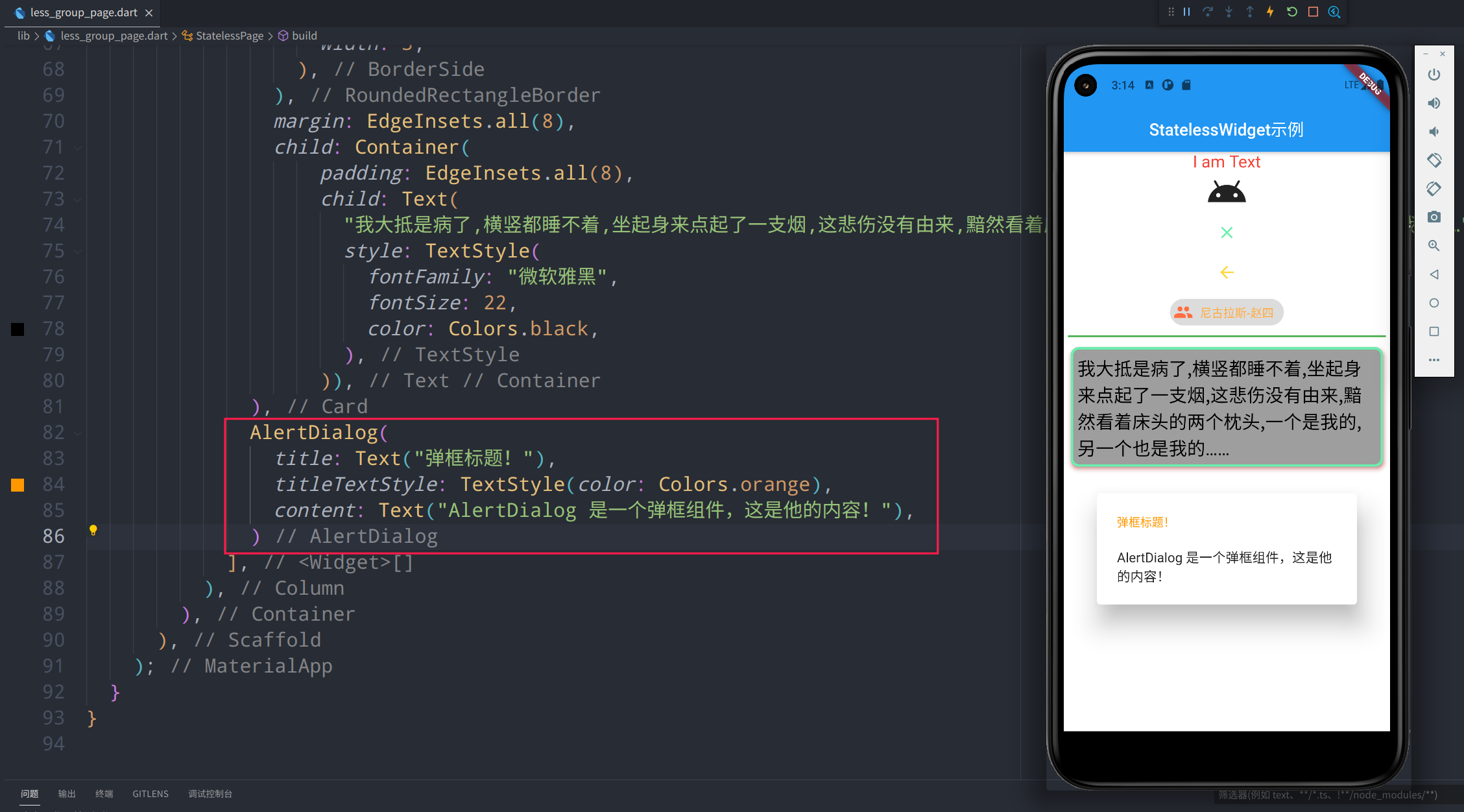
-
说明
参数名称 参数类型 参数说明 参数示例 title Widget 标题 "标题XXX" titlePadding EdgeInsetsGeometry 标题外间距 EdgeInsets.fromLTRB(24.0, 20.0, 24.0, 24.0) titleTextStyle TextStyle 标题样式 TextStyle(color: Colors.orange) content Widget 内容组件 Text("弹框组件的内容!") contentPadding EdgeInsetsGeometry 内容外间距 EdgeInsets.fromLTRB(24.0, 20.0, 24.0, 24.0) contentTextStyle TextStyle 内容文本样式 TextStyle(color: Colors.orange) actions List 事件子组件 [FlatButton(onPressed: (){...}, child: Text("cancel")), FlatButton(onPressed: (){...}, child: Text("ok"))] actionsPadding EdgeInsetsGeometry 事件子控件间距 EdgeInsets.zero actionsOverflowDirection VerticalDirection 事件过多竖向展示时顺序 VerticalDirection.down actionsOverflowButtonSpacing double 事件竖向展示时组件间距 10 buttonPadding EdgeInsetsGeometry actions 中每个按钮边缘填充距离 EdgeInsets.all(8) backgroundColor Color 背景色 Colors.orange elevation double 阴影高度 10 semanticLabel String 语义标签 insetPadding EdgeInsets 对话框距离屏幕边缘间距 EdgeInsets.symmetric(horizontal: 40.0, vertical: 24.0) clipBehavior Clip 超出部分剪切方式 Clip.none shape ShapeBorder 形状 RoundedRectangleBorder(borderRadius: BorderRadius.circular(10), side: BorderSide(color: Colors.greenAccent, width: 3)) scrollable bool 是否可以滚动 false
StatefulWidget
常用组件库
graph LR
StatefulWidget--> A(MaterialApp 材料设计)
StatefulWidget--> B(Scaffold 脚手架)
StatefulWidget--> C(AppBar 顶部应用栏)
StatefulWidget--> D(ButtonNavigationBar 底部导航栏)
StatefulWidget--> E(RefreshIndicator 下拉刷新)
StatefulWidget--> F(Image 图片)
StatefulWidget--> G(TextField 输入框)
StatefulWidget--> H(PageView 页面浏览)
实践示例
MaterialApp
-
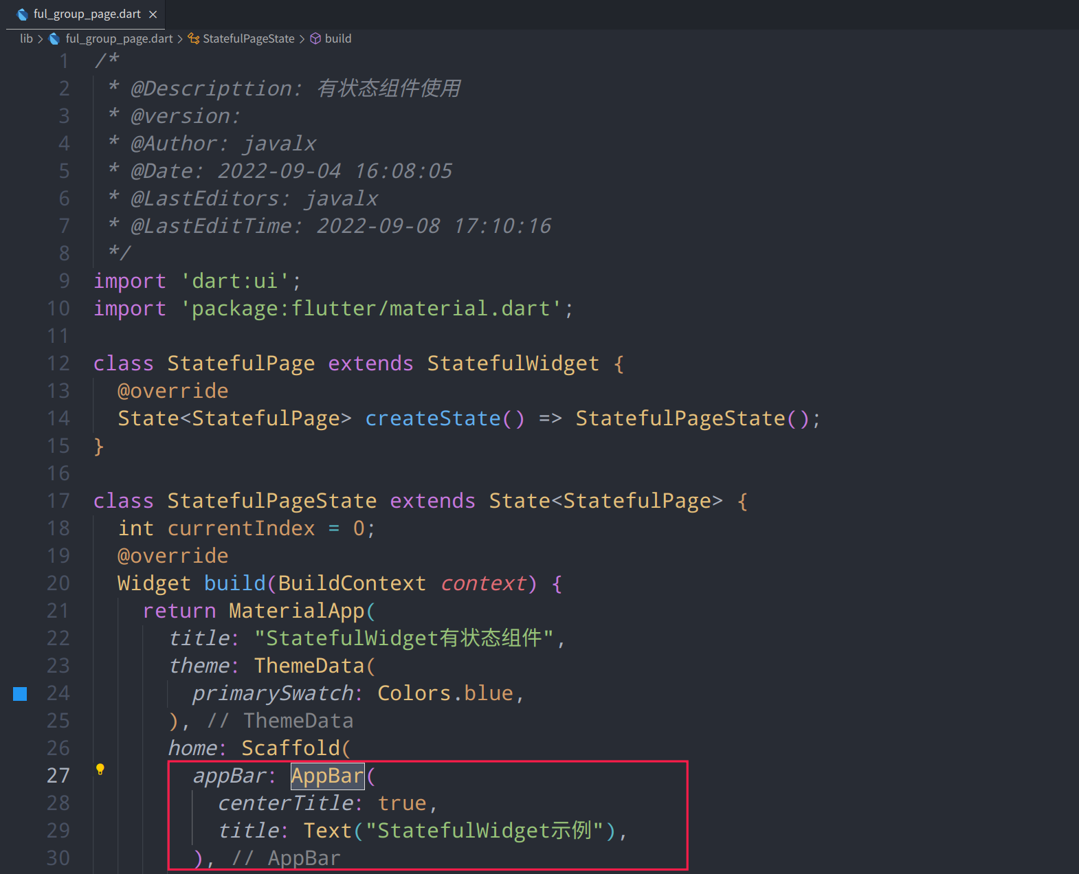
代码
MaterialApp( title: "StatelessWidget无状态组件", theme: ThemeData( primarySwatch: Colors.blue, ), ...... ... ) -
图例
-
说明
参数名称 参数类型 参数说明 参数示例 navigatorKey GlobalKey 导航键 scaffoldMessengerKey GlobalKey 脚手架键 home Widget 主页,应用打开时显示的页面 Scaffold() routes Map<String, WidgetBuilder> 应用程序顶级路由表 initialRoute String 如果构建了导航器,则会显示第一个路由的名称 onGenerateRoute RouteFactory 路由管理拦截器 onGenerateInitialRoutes InitialRouteListFactory 生成初始化路由 onUnknownRoute RouteFactory 当onGenerateRoute无法生成路由时调用 navigatorObservers List 创建导航器的观察者列表 builder TransitionBuilder 在导航器上面插入小部件 title String 程序切换时显示的标题 onGenerateTitle GenerateAppTitle 程序切换时生成标题字符串 color Color 程序切换时应用图标背景颜色(仅安卓有效) theme ThemeData 主题颜色 ThemeData(primarySwatch: Colors.blue) darkTheme ThemeData 暗黑模式主题颜色 highContrastTheme ThemeData 系统请求“高对比度”使用的主题 highContrastDarkTheme ThemeData 系统请求“高对比度”暗黑模式下使用的主题颜色 themeMode ThemeMode 使用哪种模式的主题(默认跟随系统) locale Locale 初始区域设置 localizationsDelegates Iterable<LocalizationsDelegate> 本地化代理 localeListResolutionCallback LocaleListResolutionCallback 失败或未提供设备的语言环境 localeResolutionCallback LocaleResolutionCallback 负责计算语言环境 supportedLocales Iterable 本地化地区列表 debugShowMaterialGrid bool 绘制基线网格叠加层(仅debug模式) showPerformanceOverlay bool 显示性能叠加 checkerboardRasterCacheImages bool 打开栅格缓存图像的棋盘格 checkerboardOffscreenLayers bool 打开渲染到屏幕外位图的层的棋盘格 showSemanticsDebugger bool 打开显示可访问性信息的叠加层 debugShowCheckedModeBanner bool 调试显示检查模式横幅 shortcuts Map<LogicalKeySet, Intent> 应用程序意图的键盘快捷键的默认映射 actions Map<Type, Action> 包含和定义用户操作的映射 restorationScopeId String 应用程序状态恢复的标识符
Scaffold
-
代码
Scaffold( appBar: ..., body: ..., ...... ... ) -
图例
-
说明
AppBar 顶部应用栏
-
代码
AppBar( centerTitle: true, title: Text("StatefulWidget示例"), ) -
图例
-
说明
ButtonNavigationBar 底部导航栏
-
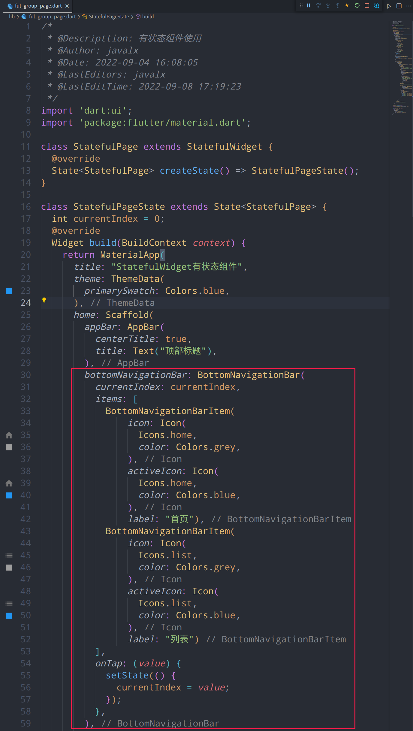
代码
class StatefulPageState extends State<StatefulPage> { int currentIndex = 0; @override Widget build(BuildContext context) { return MaterialApp( title: "StatefulWidget有状态组件", theme: ThemeData( primarySwatch: Colors.blue, ), home: Scaffold( appBar: AppBar( centerTitle: true, title: Text("顶部标题"), ), bottomNavigationBar: BottomNavigationBar( currentIndex: currentIndex, items: [ BottomNavigationBarItem( icon: Icon( Icons.home, color: Colors.grey, ), activeIcon: Icon( Icons.home, color: Colors.blue, ), label: "首页"), BottomNavigationBarItem( icon: Icon( Icons.list, color: Colors.grey, ), activeIcon: Icon( Icons.list, color: Colors.blue, ), label: "列表") ], onTap: (value) { setState(() { currentIndex = value; }); }, ), ) ) } } -
图例


-
说明
RefreshIndicator 下拉刷新
-
代码
AlertDialog( title: Text("弹框标题!"), titleTextStyle: TextStyle(color: Colors.orange), content: Text("AlertDialog 是一个弹框组件,这是他的内容!"), ) -
图例
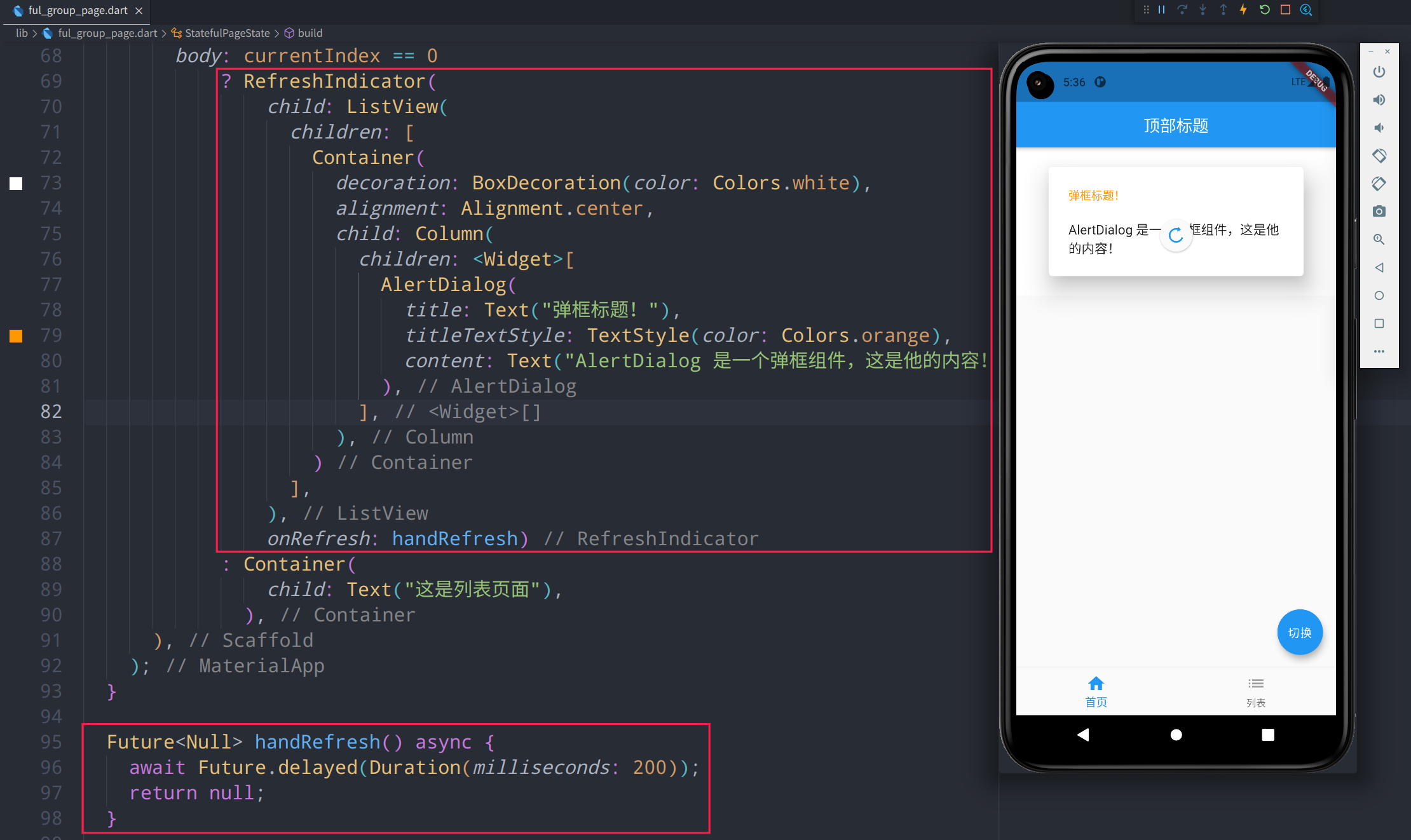
-
说明
Image 图片
-
代码
Image.network( "https://p1-juejin.byteimg.com/tos-cn-i-k3u1fbpfcp/mark:3024:3024:3024:1702.awebp", ), -
图例
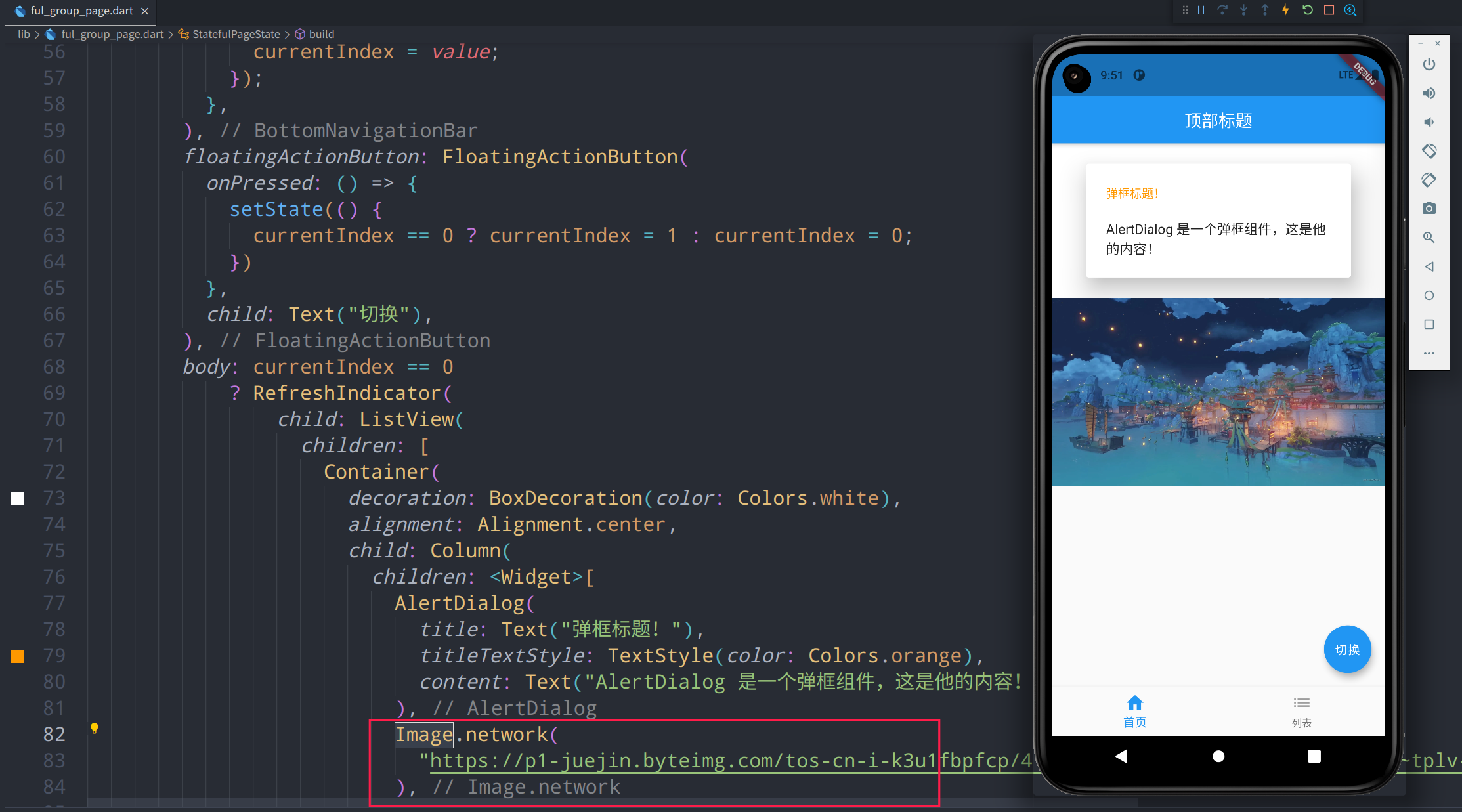
-
说明
TextField 输入框
-
代码
TextField( decoration: InputDecoration( contentPadding: EdgeInsets.fromLTRB(5, 0, 0, 0), hintText: "请输入用户名", hintStyle: TextStyle(fontSize: 18, color: Colors.grey) ), style: TextStyle(fontSize: 22, color: Colors.blue), ), -
图例
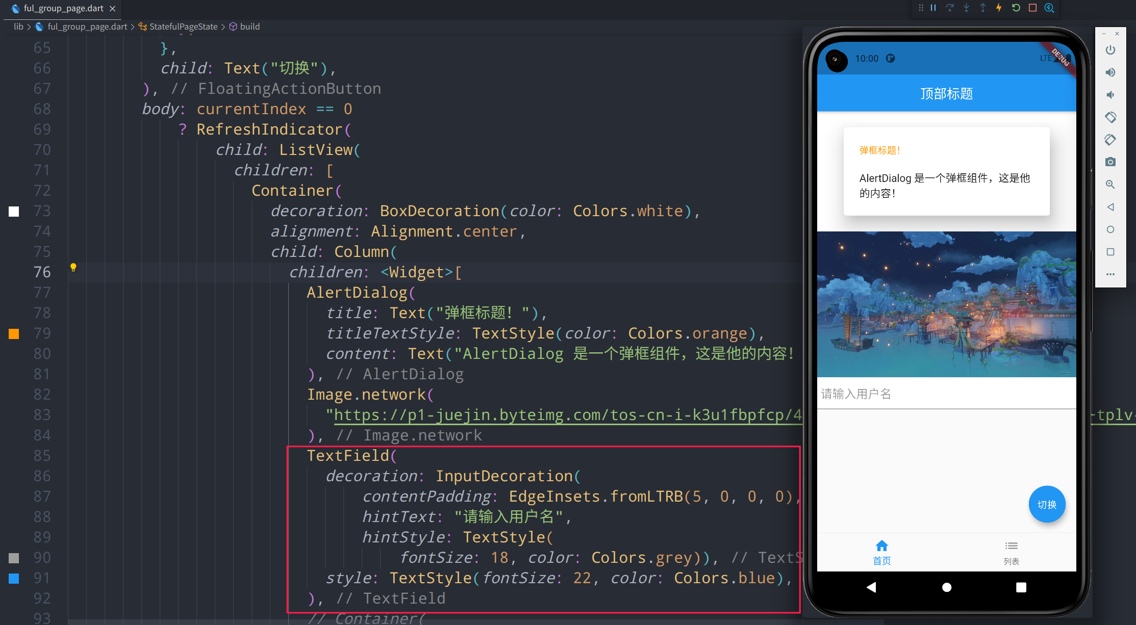
-
说明
PageView 页面浏览
-
代码
Container( height: 200, margin: EdgeInsets.all(5), decoration: BoxDecoration(color: Colors.lightGreen), child: PageView( children: [ _item("Page 1", Colors.redAccent), _item("Page 2", Colors.greenAccent), _item("Page 3", Colors.blueAccent), _item("Page 4", Colors.orangeAccent) ], ), ) _item(String title, Color color) { return Container( decoration: BoxDecoration(color: color), child: Text( title, textAlign: TextAlign.center, style: TextStyle(color: Colors.black), ), ); } -
图例
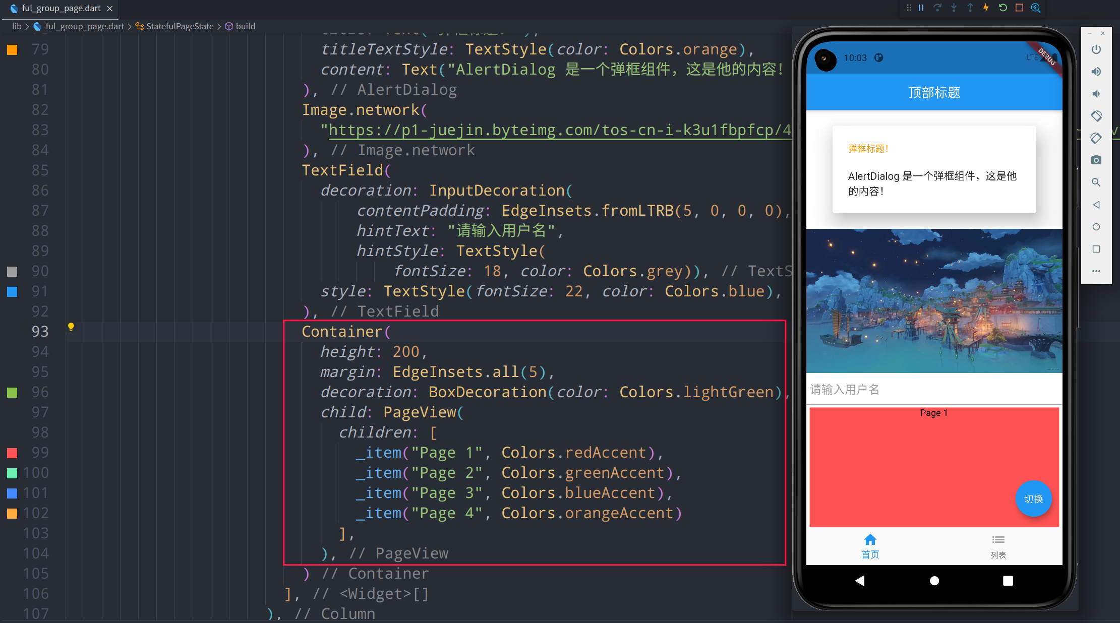
-
说明
评论区